|
|
Log In |
| Home | Forums | Shops | Trade | Avatar | Inbox | Games | Donate |
| Not Logged In |
 Trisphee
 |
|
|
Thread Tools |
Tohopekaliga

Forward Thinker


|
|
Toho's Dev Diary, 4 June - Front+shops | #1 | |
|
Okay! So, stuff was accomplished this week, yay!
Biggest thing, of course, is that the front page update was completed with...minimal issues. It's so much nicer. Galla, remind me to make your editor page. A few things to point out about it, development-wise: The random featured item necessitated I actually code up a thing I had intended when I first did shops: Linking directly to items in the shop. It's really just putting slightly more routing code into the Angular app that runs the shops, so that it knows how to deal with the item ID on the url. If you want to use a direct link (say, in a thread somewhere), there's a link at the bottom of every item's popup now that you can click on to get the link directly to that item. 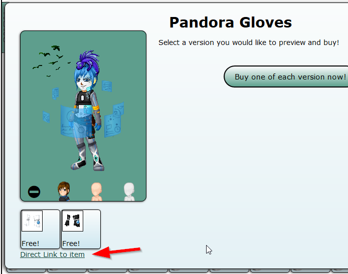 At some point, I need to figure out an icon to use for that instead of just that text link. Make it more stylish, you know. Image rotators (like the 'headline' or 'features' thing at the top of the front) have a bazillion different ways to do them these days. I spent a while looking around at ways other people did them. Guides and things. There is an interesting tendency among programmers and web developers to go way overboard on complexity. My own solution for it was to use some ideas from some of those overkill solutions to make a fairly simplistic mostly-css-trickery style of rotator. You can get a sense of what it's doing if you click the little pips on the left to make the rotator back up...you'll end up seeing the third banner slip by real fast to be in position. It's like a tiny deck of cards, shuffling by one by one, and going backward ends up being weird. But hey, it's a cool looking bug, so I left it. (Also, making nothing extra appear when going backward ends up being overly complicated.) I think I need to come up with a nice 'small avatar frame' to use for front page and user profiles, because borderless they end up looking kind of bad. Will get to that at some point. My new project that I'm doing now is an update to the shops again. This time, I'm going to make it so select shops--namely Archaic Antiquities--will have "Sets" in a different fashion from regular display. There are already sets of sorts with all like items grouped together so we don't have bazillions of pages of left socks, but that doesn't really help for monthlies and seasonals. Go visit Archaic Antiquities now. Can you, at a glance, tell what items will be there for a while, and which ones are going boof in a couple days? I sure can't. At the moment, I'm still working out how to do the presentation for it, but I have a UI trickery style grouping done right now (The sets are entirely fake, and done by javascript, just so I can work out how to display it), and here's how it currently looks: 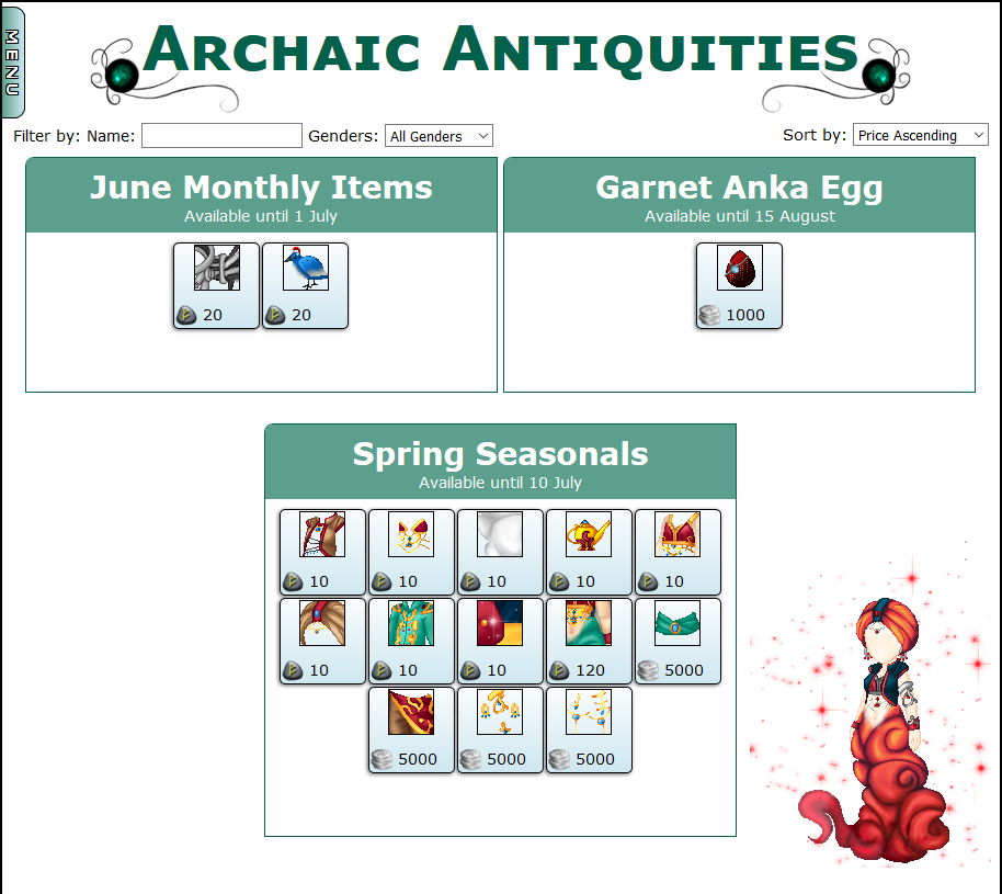 Much clearer! Still lacks something, visually. I'll figure it out, though. I will most likely turn off the filters in shops with sets like this, because there are not intended to be many items in shops doing this. Notably, being able to sort the items in this fashion will also make it much easier in the future to have an "item museum" where you can look at past monthlies, event items, and the like...since the sets will already be there. Of course, old items will require going through and manually grouping them up, figuring out when they're from, and labeling as such. That'll take a while... As always, feel free to tell me what you think of what I'm working on, or what you think I should be working on. :) | ||||

| Posted 06-04-2016, 11:08 AM |

| ||
|
|
#2 |
Tiva
Lynx Rufus
|
||
|
Make the Header of each group a line and only have line per row, the Monthly Items and Anka Egg being wider than the Seasonal set is throwing me off.
It looks good though and it seems like a huge step in the right direction of coding an automated item guide. I am sure that the former Item Guide staff will thank you for not forcing them to do the preview via copy paste anymore. | ||||
|
| Posted 06-04-2016, 11:14 AM |
| ||


|
Tohopekaliga
Forward Thinker
|
|
#3 | ||
|
I'm not entirely sure what you mean there, I think you accidentally a word?
But another way is something like this: 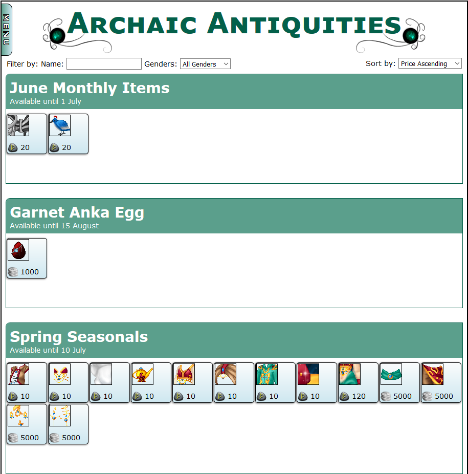 Each set taking up the entire width. Which is okay, except that most of the sets are small. The other way I had it is essentially each one is 1/2 the shop's size. I just only have 3 sets at the moment, that's why the third looks different...and it was weird having it left aligned. 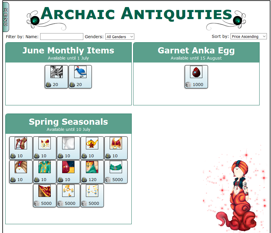
| ||||
|
| Posted 06-04-2016, 11:24 AM |
| ||
|
|
#4 |
Tiva
Lynx Rufus
|
||
|
But evenness makes everything look better! And the first is what I was talking about, my brain hasn't had coffee yet (Shhh Toho I know it is almost noon).
if you Center it it won't follow the rest of the current shop layouts unless you center those too for the last row of items being centered instead of left aligned. So…. 1 and fix the rest of the shops or 3 and maybe put a preview for the Seasonal to center it? Unless you want to remove the yearly shop and add in the Yearlies. | ||||
|
| Posted 06-04-2016, 11:33 AM |
| ||
|
Tohopekaliga
Forward Thinker
|
|
#5 | ||
|
As a matter of fact, Yearlies shop will be eliminated when this is done.
A new shop will rise in its place, but Yearlies will all go in Archaic Antiquities. But, to add a wrinkle, there's actually two Yearlies sets available at a given time. (The Heroes, and the Villains, currently) | ||||
|
| Posted 06-04-2016, 11:45 AM |
| ||
|
|
#6 |
Tiva
Lynx Rufus
|
||
|
But they are both Yearlies, and will you have two sets next year? (Who knows)
| ||||
|
| Posted 06-04-2016, 11:53 AM |
| ||
|
Tohopekaliga
Forward Thinker
|
|
#7 | ||
|
True enough.
| ||||
|
| Posted 06-04-2016, 11:56 AM |
| ||
|
|
#8 |
Illusion
The Illusionist
|
||
|
Personally I'm more of a fan of this set up since you could put avatars next to the boxes advertising/showing off the item sets of the month/season. It's a very nice eye sparkle.
On a design note. Does every box have to be Trisphee green? You could use a different color to represent the change of each month. Whether it's based off a holiday that month, or to run around the theme of the monthly items, or whatever else you can think of. For the Anka eggs for example I see "Garnet" egg yet I find it so strange that the green box isn't Garnet colored. But that's just me. Quote:
edit: I just noticed that the title of this thread had a pun in it. Most likely unintentional. Dev Diary, 4 June 
Last edited by Illusion; 06-04-2016 at 12:22 PM.
| ||||
|
| Posted 06-04-2016, 12:18 PM |
| ||
|
Tohopekaliga
Forward Thinker
|
|
#9 | ||
|
Totally 4 Junez.
It doesn't have to be green, no. That was just what I put there. Doesn't even have to be boxed and headlined like that. And that sparkle genie to the right is there to fill space. Looked so empty without something...It is a definite plus of having empty space. I can put anything there! :O | ||||
|
| Posted 06-04-2016, 01:17 PM |
| ||
|
|
#10 |
Gallagher
It Won't Stop
|
||
|
Toho, I think it can be kept to just one Yearlies category. We couldn't finish releasing the villains as planned, and it's unlikely we'll be trying the same thing next year. 4 categories with monthly, egg, seasonals, and yearlies would fill up the space nicely. When you get to the museum, you can add to that event items and special release items. Nice, even numbers of categories all around.
  | ||||
|
| Posted 06-04-2016, 08:31 PM |
| ||

|
littl3chocobo
isn't that funny
|
|
#11 | ||
|
i like the tris green and this version of the shop;
https://trisphee.com/site-assets/con...chaic-left.png | ||||
|
| Posted 06-04-2016, 09:12 PM |
| ||
|
|
#12 |
Potironette
petite fantaisiste
|
||
|
Depending on the advertising pictures, the boxy center-aligned bottom arrangement could look really good. Without pictures, I feel the top and bottom bits look kind of disjointed; or the bottom attracts too much attention from the top.
I don't like the rows of rectangles very much. It feels like the boxes matter more than the items. Also side by side feels better than up and down--it take less work to see, if that makes sense. So far, the left aligned one feels the most easy on the eyes, and easiest to understand (maybe because we read from left to right :p). Plus space for pictures xD | ||||
|
| Posted 06-04-2016, 10:21 PM |
| ||
|
«
Previous Thread
|
Next Thread
»
| Currently Active Users Viewing This Thread: 1 (0 members and 1 guests) | |
| Thread Tools | |

|
|

All content is copyright © 2010 - 2026 Trisphee.com
FAQ | E-Mail | Terms of Service | Privacy Policy | Forum Rules
Twitter | Facebook | Tumblr
FAQ | E-Mail | Terms of Service | Privacy Policy | Forum Rules
Twitter | Facebook | Tumblr