|
|
Log In |
| Home | Forums | Shops | Trade | Avatar | Inbox | Games | Donate |
| Not Logged In |
 Trisphee
 |
|
|
Thread Tools |
princeofrose

The Rose Prince


|
|
I am new here and this layout.... | #1 | |
|
So I have just joined this site. I have been on many avatar based creating sites and I just have to say...
That this thread layout is hideous. I am sorry to whoever made it but...it looks horrible. 1) The yellow block above my avatar saying how much money I made. Its not even softened and stands out with its harsh edges and the color does not compliment the teal AT ALL. 2) The gradient speech bubble. It isn't appealing at all. It looks so out of place-it should be scooted towards the avi and a little teal should show so it does not look like it is cut off. The gradient seems sloppy and out of place, and on the bottom those buttons that say "Trade" and all that stuff are an interesting design but they are just floating on the post itself. It would be much nicer if there was a bar or some design instead of just teal against stark white. It makes the pretty orbs showing you your trade button look ugly when they could be really nice. 3) The color. Its just teal...there isn't anything special about it. It is as if the person was lazy and just made a huge teal block and pasted it as the forum background. No design whatsoever-it could look much nicer. ALso BLACK against WHITE like this is so boring. (for the thread title in your post and such) with the gray gradient it sinks in and doesn't pop out and is bland. Ugh. I have only played about ten minutes of this site and I have all that to say about it-which isn't good. I am not even a graphic designer-but I do have a friend who does and I know that she could design much better. I do not mean to be mean and bash-but the first thing I said was "OMG THIS LAYOUT IS HIDEOUS" If you want to draw people into this site and compare to other sites I think you should consider getting a more appealing layout. I know this place is pretty new and everything and everythings improving but I thought I would just post my opinion so people know. Now I am ready for people to bash my brains in for saying this. :> Here we go-*posts*
Last edited by princeofrose; 01-03-2011 at 02:42 AM.
| ||||

| Posted 01-03-2011, 02:39 AM |

| ||
|
|
#2 |
SakuraMinamino
Red-aholic
|
||
|
The layout is brand new--just released yesterday, actually--and still unfinished. We are going to be making a lot of updates over the next few weeks. We have a lot of pages to add new designs to--the Trades page, for example, and other pages as well. As the home page says, we're going to be adding 7 new layouts soon as well that you can choose from if you still decide you don't like this one. And we're going to get a brand new home page as well : )
So while we do value your feedback, please hold off making your final opinion until the final version is released? It will be soon, and I know it's going to be awesome : )  This Sushi has been Fen-Bitten | ||||
|
| Posted 01-03-2011, 02:45 AM |
| ||
|
Ginger
Snap!
|
|
#3 | ||
|
I am pretty sure we'll get to pick from different color schemes soon. I think I read that somewhere. If not, sorry for the false info.
edit; Thank you Sakura for clarifying. I thought I saw that mentioned somewhere~ « ☼ ☾ ✰ » Semi-Active. | ||||
|
| Posted 01-03-2011, 02:46 AM |
| ||
|
|
#4 |
princeofrose
The Rose Prince
|
||
|
Oh okay, I did not know it was that sparkling brand new O_O
I was wondering are you going to keep it with this same color palette or? JUst wondering~ | ||||
|
| Posted 01-03-2011, 02:46 AM |
| ||
|
Panda
Heavenly Angel

|
|
#5 | ||
|
I actually agree with this. It could be better. The art is lovely but there are like only teal and white on this site. Signature should be out of the text box, because the one we have right now with the line look really messy.
| ||||
|
| Posted 01-03-2011, 02:48 AM |
| ||
|
|
#6 |
SakuraMinamino
Red-aholic
|
||
|
Meep, I apologize. I didn't mean to make that post twice. *pokes the internet* It's not too happy with me today xD
As for information on the new layouts, I'm not allowed to give that out yet ^^ Fenris might still be accepting beta testers, though--I'm not sure. If you click here you'll find the NDA: http://trisphee.com/forums/showthread.php?t=3011 And you can try and fill it out and see. Otherwise, it should be out soon enough and you can find out then ^^ I'd be more than happy to answer any other questions you have (provided I can, of course. ^^). This Sushi has been Fen-Bitten | ||||
|
| Posted 01-03-2011, 02:49 AM |
| ||
|
princeofrose
The Rose Prince
|
|
#7 | ||
|
Alright but I am going to tell you ONE more thing.
The gold bar. Too sharp...block of color. Gold against teal does not look good. Maybe if you made it a lil picture of an actually gold bad it would look cuter-or a bag of money with the numbers of how much gold you got. Oh it would be cool if-lets say you got 40.20 gold...it'll show like... like a 20 on a gold bar and a pile of coins that'd say 20. That'd be cool. Something like that-just so it isn't a gold block on the top. But thank you for replying and listening-I was surprised I thought I'd be bashed horribly or something because that tends to happen when people say their opinions on some sites i have beeon >__>; | ||||
|
| Posted 01-03-2011, 02:50 AM |
| ||
|
|
#8 |
Ashurato
Trisphee Police Force
|
||
|
's okay, Sakura. Happens every now and then. ^^
And unfortunately, I believe that beta testing for the new layouts have already been closed. But please do look forward to when they are released. | ||||
|
| Posted 01-03-2011, 02:51 AM |
| ||
|
Azrael
Blue Fish
|
|
#9 | ||
|
Guys... Teal is like, the site colour... kinda lucky we're getting other colours, honestly I think. While it's not /my/ favorite colour, it's kinda the 'trisphee' thing. which is why this is the default and basic theme.
Regardless, yes, we're getting several, like seven in fact, different themes, but they weren't quite as ready as this one. Not to mention, best get one all finished and shiny then finish up on the rest then a lil bit of this for each one, lil bit of this for each one, etc. Anyway... I /think/ the notifications button is going to be changed. I /think/. Far as the PM and Trade buttons, where would you suggest putting them? Just under the avatar seems perfectly logical and fine to me. 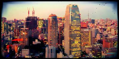 'Tis a picture of Tokyo I took. ^^ I'm a girl. I love Writing Tools, and KPop, and minty stuffs. | ||||
|
| Posted 01-03-2011, 02:54 AM |
| ||
|
|
#10 |
Ginger
Snap!
|
||
|
The Trisphee community is pretty good about not bashing on others. I'd say this is a respectable community and most of the members here are understanding. That is one of the main reasons why I love this site. If a community is rude and disrespectful, I usually don't want to have anything to do with it. I wish I would have found this site before it opened to the public <3
« ☼ ☾ ✰ » Semi-Active. | ||||
|
| Posted 01-03-2011, 02:54 AM |
| ||
|
SakuraMinamino
Red-aholic
|
|
#11 | ||
|
Ah, all right. Thanks Ash, I didn't know ^^ But yes, the new layouts will be released soon <3
And all right, thank you for the feedback ^^ We'll take it into consideration. This Sushi has been Fen-Bitten | ||||
|
| Posted 01-03-2011, 02:55 AM |
| ||
|
|
#12 |
princeofrose
The Rose Prince
|
||
|
Alright thank you!
And do you know if there is any art forum that allows you to pricecheck art? | ||||
|
| Posted 01-03-2011, 03:00 AM |
| ||
|
SakuraMinamino
Red-aholic
|
|
#13 | ||
|
You're welcome : )
And yes, there is! Here you are : ) http://trisphee.com/forums/forumdisplay.php?f=17 This Sushi has been Fen-Bitten | ||||
|
| Posted 01-03-2011, 03:04 AM |
| ||
|
|
#14 |
princeofrose
The Rose Prince
|
||
|
Thank you :D
| ||||
|
| Posted 01-03-2011, 03:14 AM |
| ||
|
Devlyn
Platypus
|
|
#15 | ||
|
I'd like to say first of all, saying that someone seemed lazy with the coloring is very rude. You have every right to dislike it but I know for a fact that the people who made the site worked very hard.
I like that the yellow stands out when I earn my Au because otherwise I wouldn't notice it. I like the teal, it may be solid colored but at least things aren't overly bright and overpowering like some other sites I could easily name. The only thing I see needing improvement that you mentioned was the little bubble showing you have a new trade, message, or comment. Je suis prisonière de moi-même, mais jamais de toi.  | ||||
|
| Posted 01-03-2011, 01:39 PM |
| ||
|
«
Previous Thread
|
Next Thread
»
| Currently Active Users Viewing This Thread: 1 (0 members and 1 guests) | |
| Thread Tools | |


|
|

All content is copyright © 2010 - 2024 Trisphee.com
FAQ | E-Mail | Terms of Service | Privacy Policy | Forum Rules
Twitter | Facebook | Tumblr
FAQ | E-Mail | Terms of Service | Privacy Policy | Forum Rules
Twitter | Facebook | Tumblr